
Your amazing product vs. the competitor’s overpriced, crappy one.
Love it. Great idea.
But… there are a few classic mistakes you really don’t want to make.
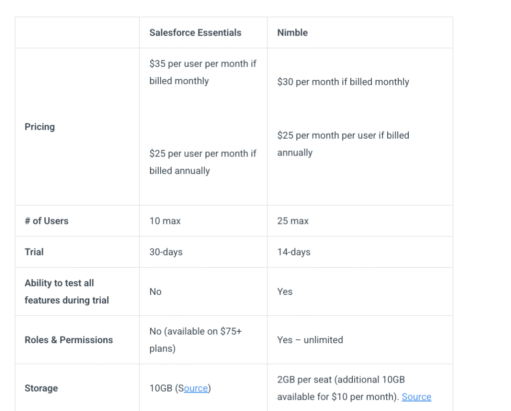
1. It just looks ridiculous. Take Nimble, (screenshot #1) for example, lining itself up against Salesforce. I don’t need a table to convince me not to buy Salesforce. But when a 64 person company compares itself to the industry giant, it comes off as cocky at best.
2. Unless you have a real advantage, you’re only shooting yourself in the foot. In the Nimble example below, the “big win” is five bucks off the monthly plan. Newsflash: no business will be taking the risk, just to save $5 a month.
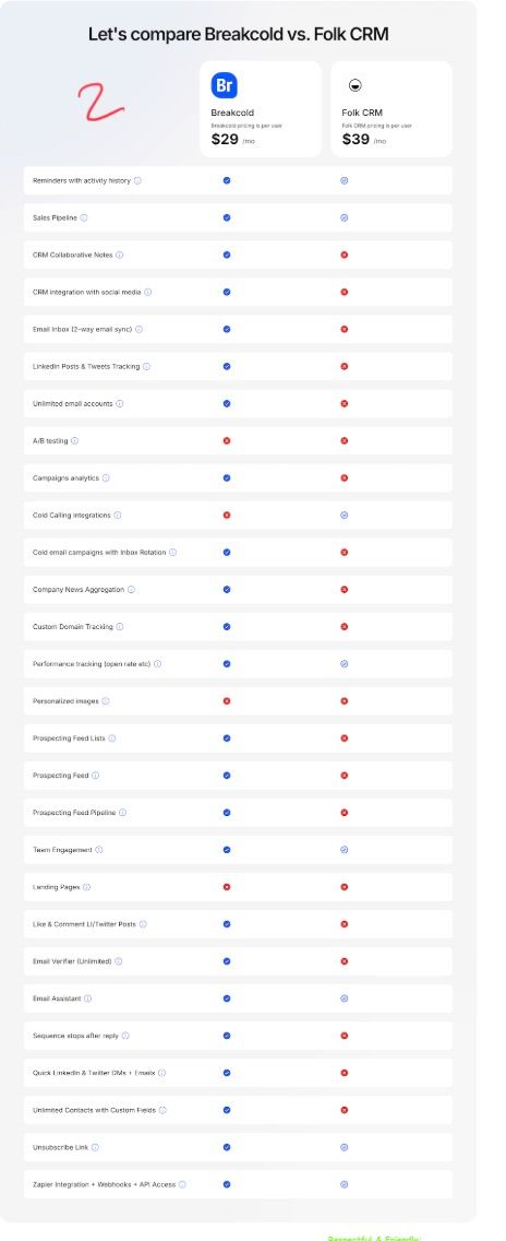
Also: keep it simple. Look at the screenshot below , too many details, too complicated, nobody will understand that.
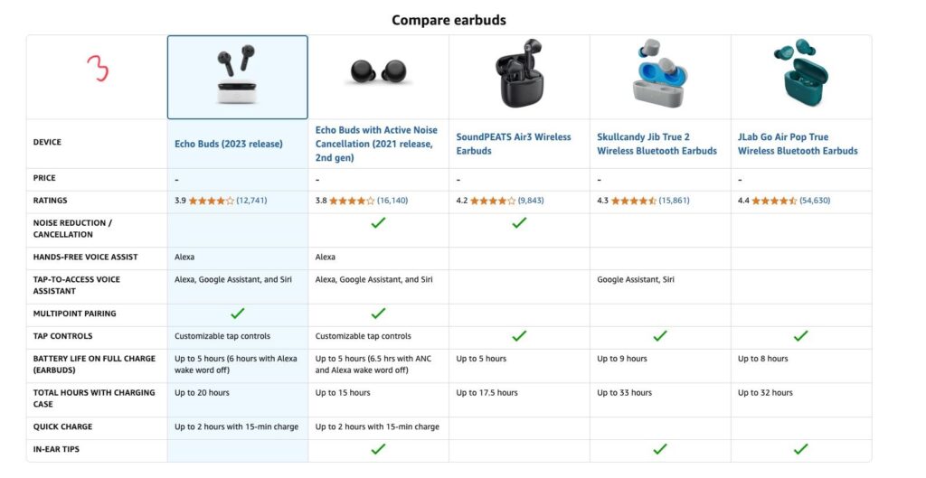
Easy. Amazon’s.
Just the basics: price, core features, done.
Copyright © 2024 All Rights Reserved.